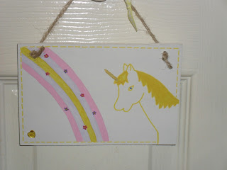
I love the idea of a magical fantasy world which is partly why I created the dragon plaques a little while ago. To carry on the fantasy theme I made some unicorn plaques in pink and purple but there was something about them that I wasn't too sure on,
So I decided to tweak them and give them a white background but again I wasn't too sure, they looked a little plain, so on went the thinking cap and after a bit of deliberation I decided to add a rainbow with little flowers.
 |
| Lola |
 |
| Lily |
 |
| Lucy |
Just like the dragons I have named these unicorns but I'm still a little unsure of them, one of the worst things about doing crafts is that its so easy to criticise yourself so readers i'm asking for your advice, which one do you prefer? The plain ones or the ones with the rainbows? Do you think they should be altered further or done completely different? I'm open to any suggestions!
Please go see what the other crafters are up to over at Handmade Monday, I'm off to bed now as I've just finished a night shift but i'll be looking through them all this evening.
Have a great week,
Jem
x


They are both nice designs, but think the plain ones make the lettering stand out more. Perhaps the rainbow could be lighter colour to enable the letters to stand out more? Hope you have a good week.
ReplyDeleteThey are lovely but I prefer them without the rainbows. I like the faux stitching round the edges (I do it on my most of my plaques and everyone seems to like it)and I like the background colours but some people will prefer white. I think maybe the eyes need a dark outline?
ReplyDeleteI like the rainbow, but I agree with the 2 above, that the words stand out better without the rainbow. So you either have to make the letters bolder, the rainbow fainter, or go back to the plain one (that is of course if you were listening to me!).
ReplyDeleteI too prefer the plain ones (think you're getting a consensus) but I think the pink unicorn needs a darker eye. They're all lovely though - well done you!
ReplyDeleteI don;t have anything to add as I agree with the above. I end up fiddling and messing and then go back to the original piece myself!
ReplyDeleteI like the ones with the rainbows, so pretty and says fantasy
ReplyDeleteI think your unicorns should have made the ark and should still be with us... lol :)
ReplyDeletei love the rainbows with the unicorns, thta would be my choice :) very cute!
ReplyDeleteThey're lovely - properly magical! I like the plain ones but everyone's different - I'd make both and let your customers decide - bet it'll work out evens!
ReplyDeleteHonestly both are cute! I think you would get takers for both. I know what you mean though... I am terrible. I have abandoned projects just because I see fault in everything.
ReplyDeleteIn prefer the plain ones, but that's just me. I would make both as I think you'll have buyers for both. xx
ReplyDeleteI like the ones with the rainbow although I think the Unicorn looks cuter (not sure that's a word!) on the one with the lilac background. Good luck!
ReplyDeleteI personally like the plain ones and think they would look great with the same border as your Dragons, which I just LOVE
ReplyDeleteI agree with Ros, it's too bad the Unicorns were playin' silly games and missed the Ark. Oh wait, that wasn't really the question was it?
ReplyDeleteI'm in the minority, but I do like the rainbow. I suppose you could make a few like that and mostly without since it's easy to add? I wonder if there is a way to incorporate the name into the rainbow? I am totally NOT a good painter so I have no idea.
I am amazed at anyone who can paint stuff like this, if I did it it would look like a 3 year old on a very bad day. :)
So some people like the rainbow and some prefer it without so I would be tempted to do both designs. BUT... I think the rainbow would only work with pale colours and not with bright primary or darker colours. It can be difficult to make these choices and sometimes it's better to go for the simpler option and go plain with the stitched boarder. (You could always make the 'stitching' rainbow coloured)!!!
ReplyDeleteOh dear, I haven't made it any easier have I??
Jan x
They are great, but having consulted with PL - we are going for the plain coloured background as our favourite. Rather than a rainbow how about some little twinking magic stars?
ReplyDeleteJo x